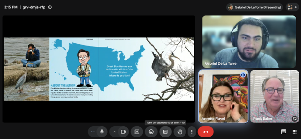
Illustrator and graphic designer Gabriel De La Torre documented the process of working on the book:
First of all, working on Close Encounters with the Great Blue Heron has been a passion project from the time Annette spoke to me about it. I’m a fan of nature-related content, and while I’ve worked on nature-related infographics in the past, the things I had the chance to design for GBH (GBH stands for the title of the book during the production workflow) were on another level.
Starting from the very concept of the book, to design an encyclopedic book and to design a photo book are two very different tasks, and for GBH we decided to combine them, which was a great idea!
I worked from the premise that we’re showcasing Frank’s pictures to the audience and at the same time we’re teaching with scientific facts that get reinforced with those same pictures.
Once we had the layout ready, we had to move on to ‘design’ said layout, so, what’s the best way to do that? Well, there’s no absolutes in design, but the choice we made was to keep it as simple as possible without leaning to hard on minimalism.
We wanted the design elements to aid in the storytelling. We were working to portray Frank’s pictures without taking the attention of said pictures.
Another thing we decided on was to include illustrations as a visual aid to the design. I did them while thinking of a way to add value to the book and help the audience visualize the different aspects of some of the more complex or on parts where we had a lot of information at the same time.
By the end of our design process, we were very happy with the final product we had. We had very few feedback rounds, but we were very careful to meet Frank’s expectations. This is the work of a lifetime after all, and we wanted to give him the book he deserved!